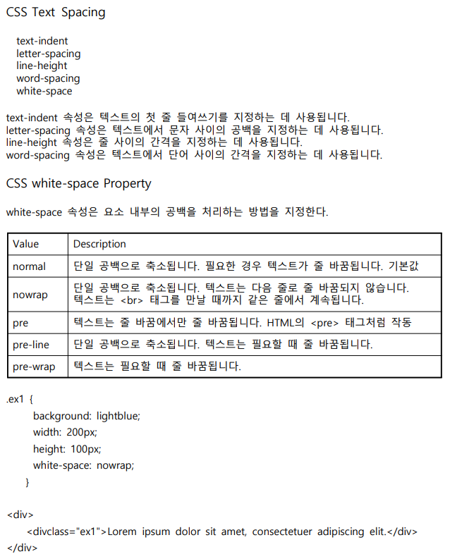
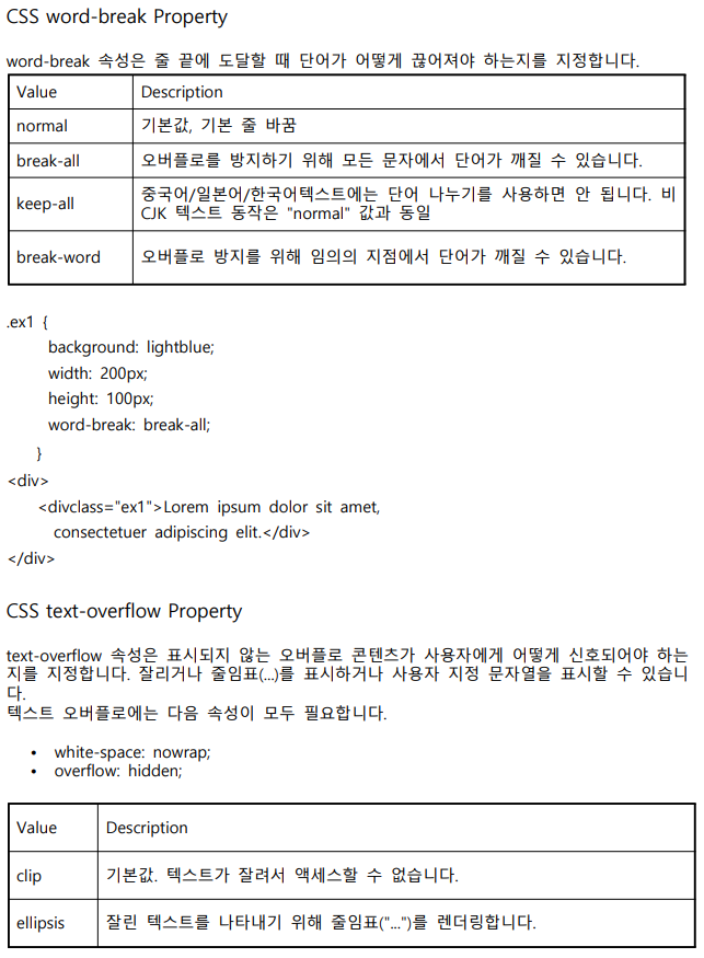
HTML5 & CSS3 : text-spacing, transform, perspective 속성
2022.10.31.
- UI/UX 반응형 웹디자인&웹퍼블리셔 개발자 과정 - DAY 32
Review
오늘 가장 어려운 transform 속성을 배웠다. 수학을 배울 때도 도형 파트가 가장 약했는데
이렇게 또 쓰이는 곳이 있을 줄이야...
그래도 이제 반응형까지 할 줄 알다니 내 자신이 너무 기특하다.
움직이는 화면까지 구현해내니까 더 재미가 있다.
조금 어렵긴 하지만 바로바로 눈에 보이니까 다행인데, 이럴 때마다 드는 생각은
백엔드 개발자 분들 완전 천재아니야? 이런 생각...ㅎㅎㅎ
존경합니당-
여튼 재밌게 배우고 있어서 너무 좋고, 나도 점점 발전하는 개발자가 되어야지
파이팅 - !
- UI/UX 반응형 웹디자인&웹퍼블리셔 개발자 과정 - DAY 32
<!DOCTYPE html>
<html lang="ko">
<head>
<meta charset="UTF-8">
<meta http-equiv="X-UA-Compatible" content="IE=edge">
<meta name="viewport" content="width=device-width, initial-scale=1.0">
<link rel="stylesheet" href="../1031/style.css">
<title>Document</title>
<style>
.ex1 {
background: lightblue;
width: 200px;
height: 100px;
}
</style>
</head>
<body>
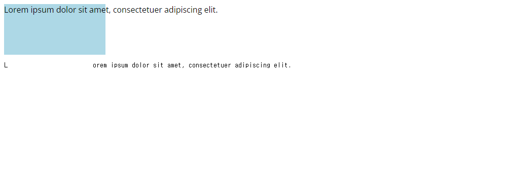
<div class="ex1">Lorem ipsum dolor sit amet, consectetuer adipiscing elit.</div>
<pre>L orem ipsum dolor sit amet, consectetuer adipiscing elit.</pre>
</body>
</html>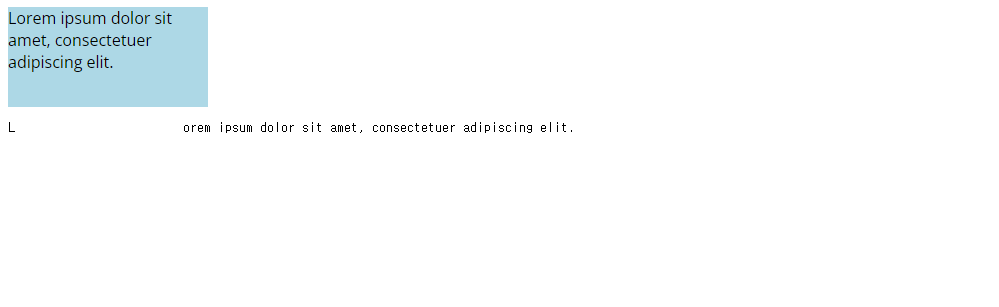
.ex1 {
background: lightblue;
width: 200px;
height: 100px;
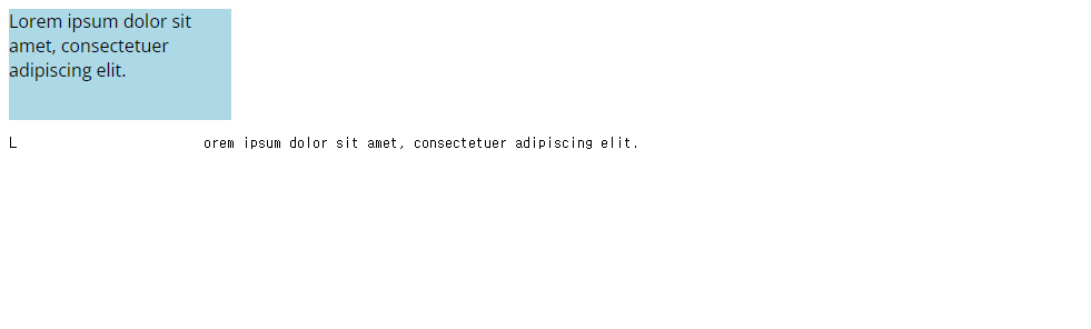
white-space: nowrap;
}
.ex1 {
background: lightblue;
width: 200px;
height: 100px;
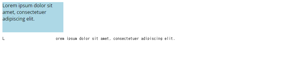
white-space: pre-line;
}
.ex1 {
            background: lightblue;
            width: 200px;
            height: 100px;
            white-space: pre-wrap;
        }
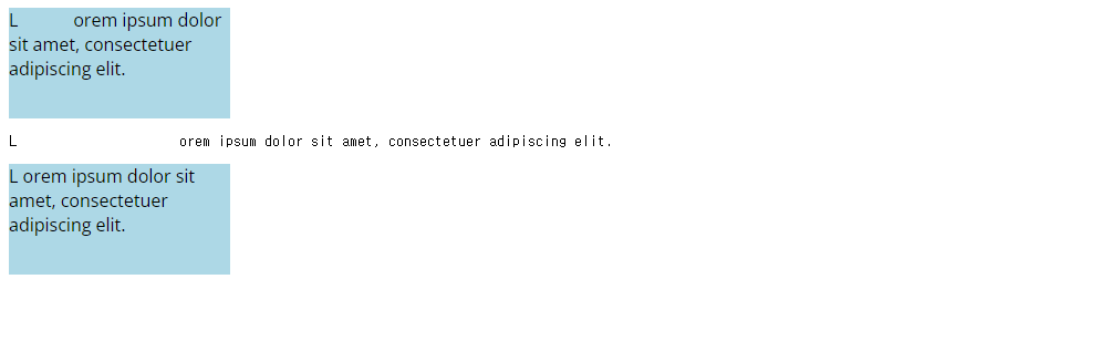
<body>
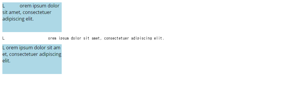
<div class="ex ex1">L orem ipsum dolor sit amet, consectetuer adipiscing elit.</div>
<pre>L orem ipsum dolor sit amet, consectetuer adipiscing elit.</pre>
<div class="ex ex2">L orem ipsum dolor sit amet, consectetuer adipiscing elit.</div>
</body>.ex {
background: lightblue;
width: 200px;
height: 100px;
}
.ex1 {
white-space: pre-wrap;
}
.ex2 {
word-break: break-all;
}
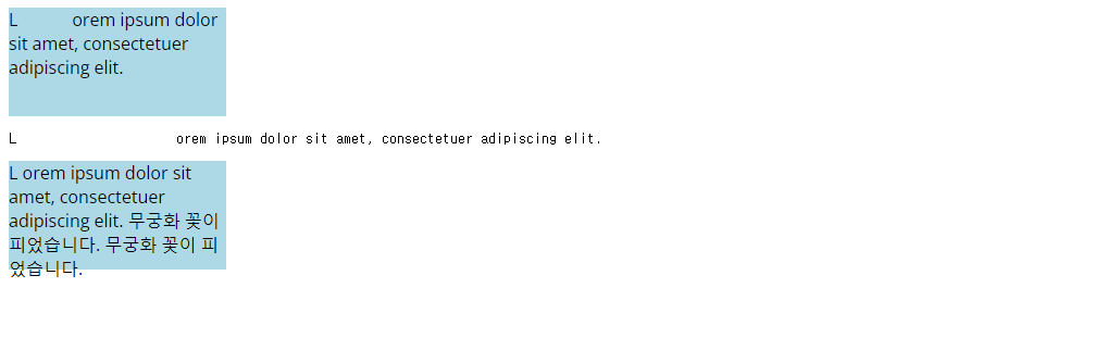
.ex {
            background: lightblue;
            width: 200px;
            height: 100px;
        }
        .ex1 {
            white-space: pre-wrap;
        }
        .ex2 {
           word-break: keep-all;
        }
<body>
<div class="ex ex1">L orem ipsum dolor sit amet, consectetuer adipiscing elit.</div>
<pre>L orem ipsum dolor sit amet, consectetuer adipiscing elit.</pre>
<div class="ex ex2">L orem ipsum dolor sit amet, consectetuer adipiscing elit. 무궁화 꽃이 피었습니다. 무궁화 꽃이 피었습니다.</div>
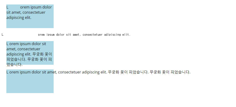
</body>.ex {
background: lightblue;
width: 200px;
height: 100px;
}
.ex1 {
white-space: pre-wrap;
}
.ex2 {
word-break: break-word;
}
<body>
    <div class="ex ex1">L            orem ipsum dolor sit amet, consectetuer adipiscing elit.</div>
    <pre>L                     orem ipsum dolor sit amet, consectetuer adipiscing elit.</pre>
    <div class="ex ex2">L      orem ipsum dolor sit amet, consectetuer adipiscing elit. 무궁화 꽃이 피었습니다. 무궁화 꽃이 피었습니다.</div>
    <div class="ex ex3">L      orem ipsum dolor sit amet, consectetuer adipiscing elit. 무궁화 꽃이 피었습니다. 무궁화 꽃이 피었습니다.</div>

</body>
.ex {
background: lightblue;
width: 200px;
height: 100px;
margin: 20px;
}
.ex1 {
white-space: pre-wrap;
}
.ex2 {
word-break: break-word;
}
.ex3 {
white-space: nowrap;
}
 .ex {
            background: lightblue;
            width: 200px;
            height: 100px;
            margin: 20px;
        }
        .ex1 {
            white-space: pre-wrap;
        }
        .ex2 {
           word-break: break-word;
        }
        .ex3 {
            white-space: nowrap;
            overflow: hidden;
            text-overflow: ellipsis;
        }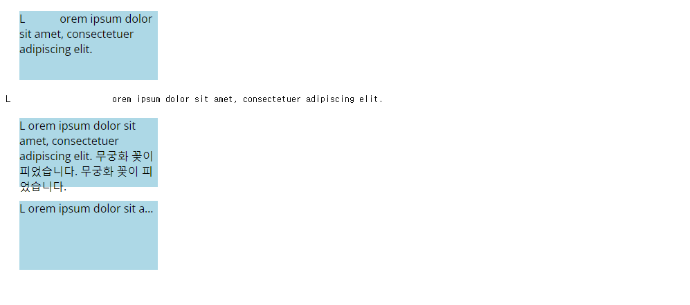
혼자는 못 쓰고 overflow: hidden;과 text-overflow: ellipsis; 속성을 함께 사용해야 위와 같이
나타난다.
<transform, perspective 속성 알아보기>
cubic-bezier(.17,.67,.83,.67) ✿ cubic-bezier.com
cubic-bezier.com
cubic-bezier.com
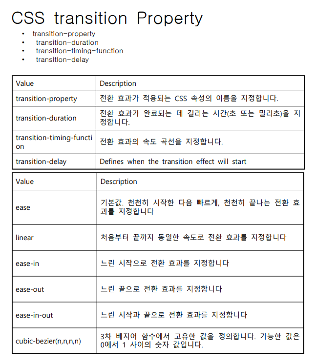
위의 표 맨 아래에 있는 cubic-bezier는 이 사이트에서 직접 원하는 transition의 속도를 조절할 수
있다. 곡선 형태의 그래프를 통해 원하는 값을 설정한 후 상단에 있는 copy 버튼을 통해 값을 복사
할 수 있다.
<!DOCTYPE html>
<html lang="ko">
<head>
<meta charset="UTF-8">
<meta http-equiv="X-UA-Compatible" content="IE=edge">
<meta name="viewport" content="width=device-width, initial-scale=1.0">
<link rel="stylesheet" href="../1031/style.css">
<title>Document</title>
<style>
.ex {
background: lightblue;
width: 200px;
height: 200px;
margin: 20px;
}
</style>
</head>
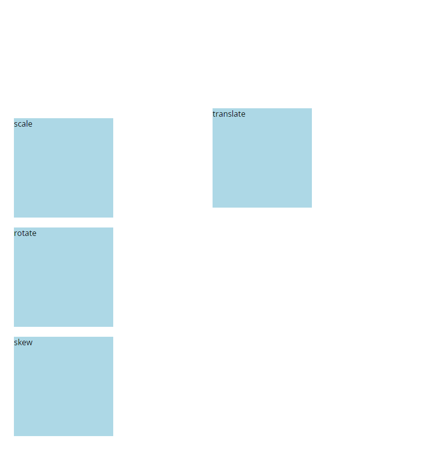
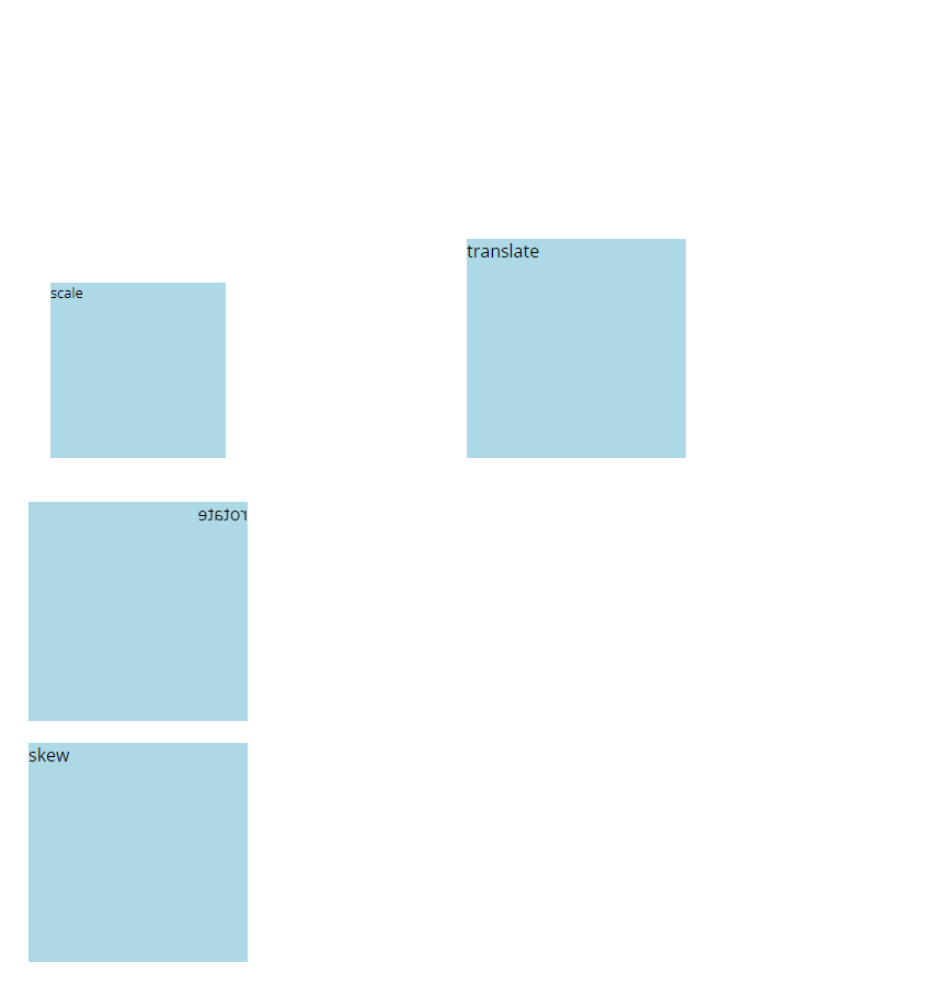
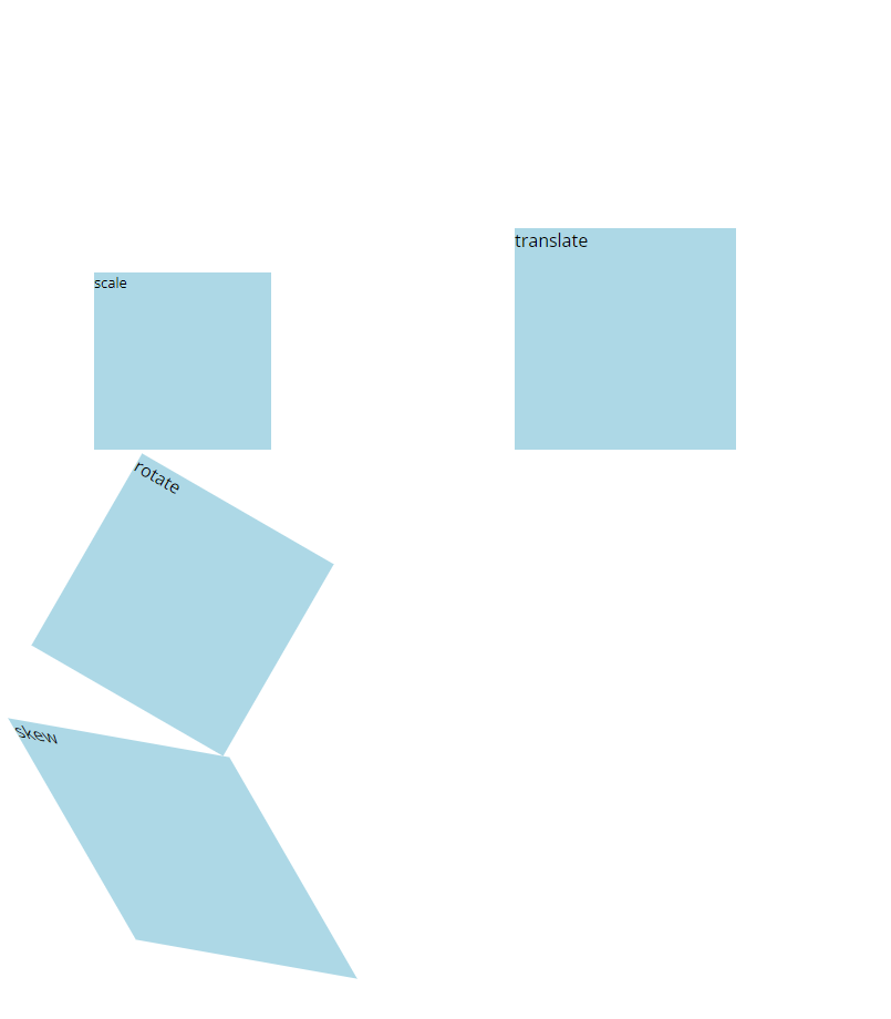
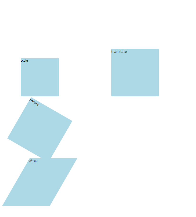
<body>
<div class="ex ex1">translate</div>
<div class="ex ex2">scale</div>
<div class="ex ex3">rotate</div>
<div class="ex ex4">skew</div>
</body>
</html>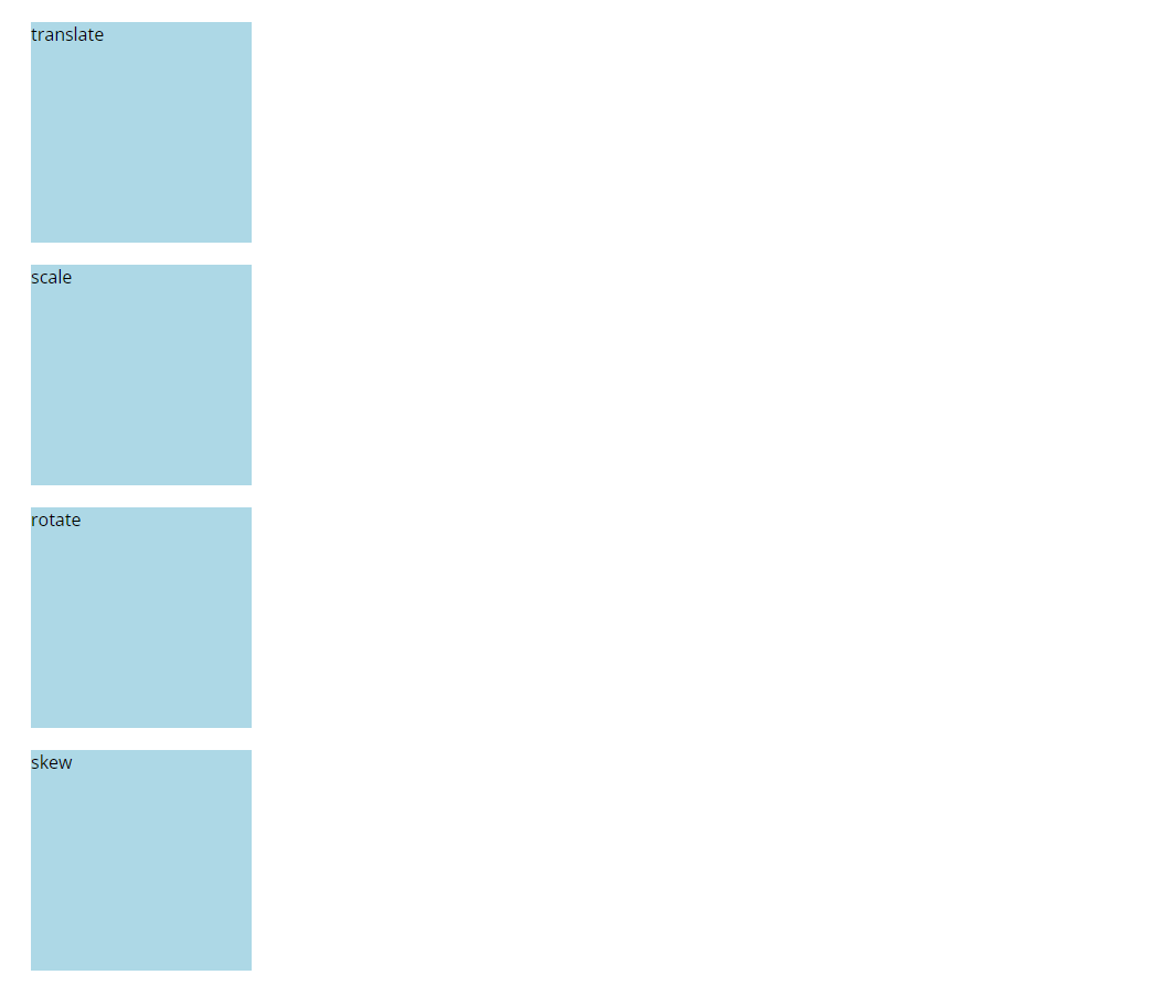
X 좌우 Y위아래 Z앞뒤
.ex {
            background: lightblue;
            width: 200px;
            height: 200px;
            margin: 20px;
        }
        .ex1 {
            transform: translate(400px,200px)
        }
.ex {
background: lightblue;
width: 200px;
height: 200px;
margin: 20px;
}
.ex1 {
transform: translate(400px,200px)
}
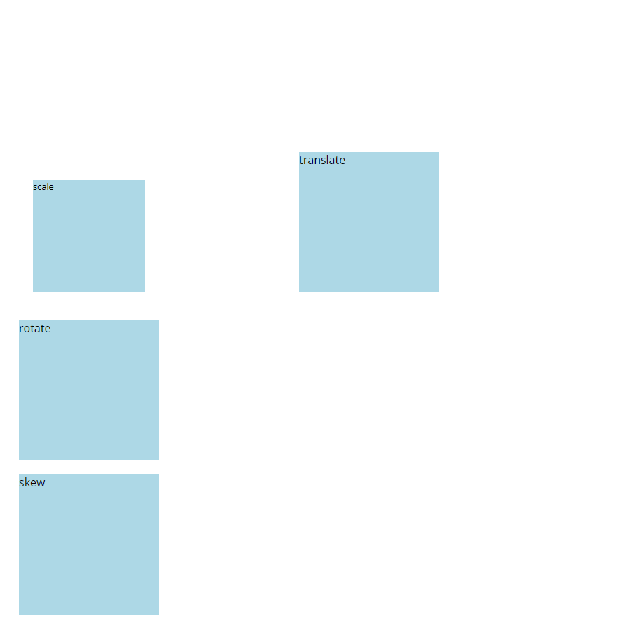
.ex2 {
transform: scale(0.8);
}
.ex {
background: lightblue;
width: 200px;
height: 200px;
margin: 20px;
}
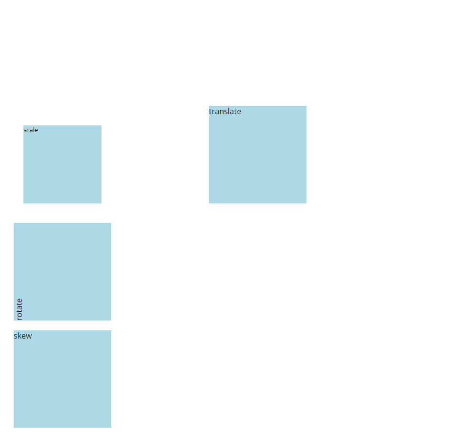
.ex1 {
transform: translate(400px,200px)
}
.ex2 {
transform: scale(0.8);
}
.ex3 {
transform: rotate(-90deg);
}
.ex {
background: lightblue;
width: 200px;
height: 200px;
margin: 20px;
}
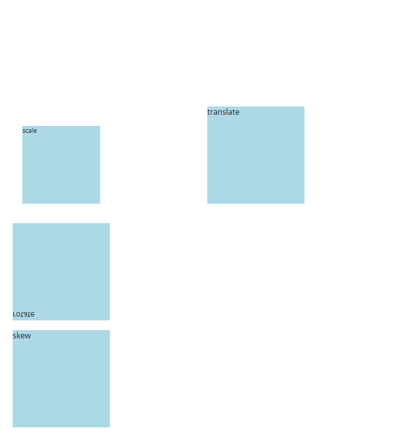
.ex1 {
transform: translate(400px,200px)
}
.ex2 {
transform: scale(0.8);
}
.ex3 {
transform: rotateX(180deg);
}
.ex {
            background: lightblue;
            width: 200px;
            height: 200px;
            margin: 20px;
        }
        .ex1 {
            transform: translate(400px,200px)
        }
        .ex2 {
            transform: scale(0.8);
        }
        .ex3 {
            transform: rotateY(180deg);
        }
.ex {
            background: lightblue;
            width: 200px;
            height: 200px;
            margin: 40px;
        }
        .ex1 {
            transform: translate(400px,200px)
        }
        .ex2 {
            transform: scale(0.8);
        }
        .ex3 {
            transform: rotateZ(30deg);
        }
.ex {
            background: lightblue;
            width: 200px;
            height: 200px;
            margin-left: 60px;
            margin-bottom: 20px;
        }
        .ex1 {
            transform: translate(400px,200px)
        }
        .ex2 {
            transform: scale(0.8);
        }
        .ex3 {
            transform: rotateZ(30deg);
        }
        .ex4 {
            transform: skew(30deg,10deg);
        }
.ex {
            background: lightblue;
            width: 200px;
            height: 200px;
            margin-left: 60px;
            margin-bottom: 20px;
        }
        .ex1 {
            transform: translate(400px,200px)
        }
        .ex2 {
            transform: scale(0.8);
        }
        .ex3 {
            transform: rotateZ(30deg);
        }
        .ex4 {
            transform: skew(-30deg);
        }
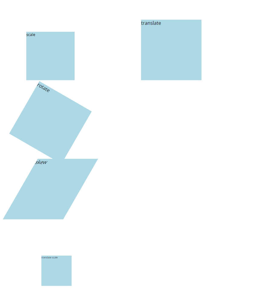
<body>
    <div class="ex ex1">translate</div>
    <div class="ex ex2">scale</div>
    <div class="ex ex3">rotate</div>
    <div class="ex ex4">skew</div>
    <div class="ex ex5">translate scale</div>
</body>
.ex {
background: lightblue;
width: 200px;
height: 200px;
margin-left: 60px;
margin-bottom: 20px;
}
.ex1 {
transform: translate(400px,200px)
}
.ex2 {
transform: scale(0.8);
}
.ex3 {
transform: rotateZ(30deg);
}
.ex4 {
transform: skew(-30deg);
}
.ex5 {
transform: translate(20px, 50px) scale(0.5);
}
<transform 속성 예제>
<!DOCTYPE html>
<html lang="ko">
<head>
    <meta charset="UTF-8">
    <meta http-equiv="X-UA-Compatible" content="IE=edge">
    <meta name="viewport" content="width=device-width, initial-scale=1.0">
    <link rel="stylesheet" href="../1031/style.css">
    <title>Document</title>
    <style>
        body {
            display: flex;
            width: 1000px;
            margin: 50px auto;
        }
        .ex {
            background: rgb(255, 250, 250);
            width: 220px;
            height: 260px;
            box-shadow: 8px 8px 8px gray;
            text-align: center;
            line-height: 35px;
            padding-top: 10px;
        }
        .ex img {
            width: 200px;
            height: 200px;
        }
        .ex1 {
            transform: rotate(-10deg);
        }
        .ex2 {
            transform: rotate(10deg);
        }
        .ex3 {
            transform: rotate(-10deg);
        }
        .ex4 {
            transform: rotate(5deg);
        }

    </style>
</head>
<body>
    <div class="ex ex1"><img src="../../images/photo1.jpg" alt="">photo1</div>
    <div class="ex ex2"><img src="../../images/photo2.jpg" alt="">photo2</div>
    <div class="ex ex3"><img src="../../images/photo3.jpg" alt="">photo3</div>
    <div class="ex ex4"><img src="../../images/photo4.jpg" alt="">photo4</div>
</body>
</html>
<!DOCTYPE html>
<html lang="ko">
<head>
    <meta charset="UTF-8">
    <meta http-equiv="X-UA-Compatible" content="IE=edge">
    <meta name="viewport" content="width=device-width, initial-scale=1.0">
    <link rel="stylesheet" href="../1031/style.css">
    <title>Document</title>
    <style>
        .out {
            width: 500px;
            height: 500px;
            border: 1px solid #000;
        }
        .in {
            width: 100px;
            height: 100px;
            background: #ccc;
        }
    </style>
</head>
<body>
    <div class="out">
        <div class="in"></div>
    </div>
</body>
</html>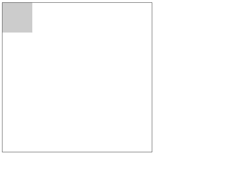
 .out {
            width: 500px;
            height: 500px;
            border: 1px solid #000;
        }
        .in {
            width: 100px;
            height: 100px;
            background: #ccc;
            transform: translate(100px);
        }
 .out {
            width: 100px;
            height: 100px;
            border: 1px solid #000;
        }
        .in {
            width: 100px;
            height: 100px;
            background: #ccc;
            transform: scale(0.5);
            transform-origin: center;
        }
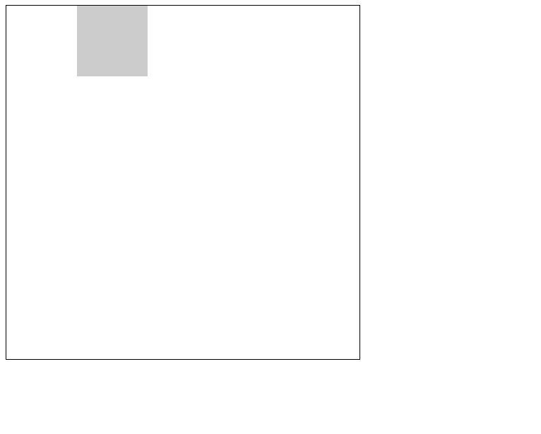
        .out {
            width: 100px;
            height: 100px;
            border: 1px solid #000;
        }
        .in {
            width: 100px;
            height: 100px;
            background: #ccc;
            transform: scale(0.5);
            transform-origin: 10px 20px;
        }
<!DOCTYPE html>
<html lang="ko">
<head>
    <meta charset="UTF-8">
    <meta http-equiv="X-UA-Compatible" content="IE=edge">
    <meta name="viewport" content="width=device-width, initial-scale=1.0">
    <link rel="stylesheet" href="../1031/style.css">
    <title>Document</title>
    <style>
        div {
            position: relative;
            width: 400px;
            height: 400px;
            margin: 100px auto;
            transform-style: preserve-3d;
            perspective: 800px;
        }
        img {
            position: absolute;
            opacity: 0.5;
            width: 100%;
            height: 100%;
        }
        img:first-child {
            transform: rotateX(-90deg) translateZ(200px);
        }
        img:nth-child(2) {
            transform: translateZ(-200px);
        }
    </style>
</head>
<body>
    <div>
        <img src="../../images/photo1.jpg" alt="photo1">
        <img src="../../images/photo2.jpg" alt="photo2">
    </div>
</body>
</html>
div {
            position: relative;
            width: 400px;
            height: 400px;
            margin: 100px auto;
            transform-style: preserve-3d;
            perspective: 2000px;
        }
        img {
            position: absolute;
            opacity: 0.5;
            width: 100%;
            height: 100%;
        }
        img:first-child {
            transform: rotateX(-90deg) translateZ(200px);
        }
        img:nth-child(2) {
            transform: translateZ(-200px);
        }
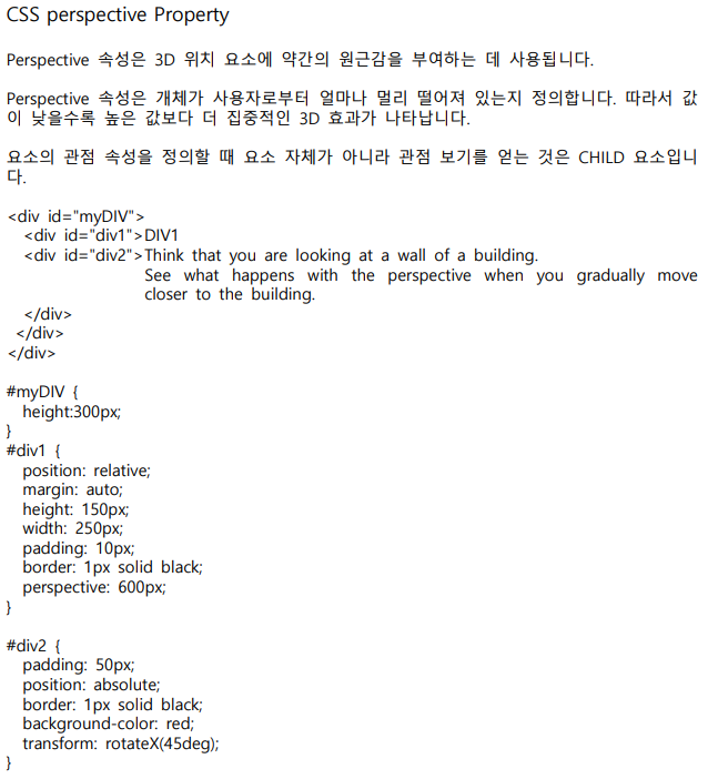
perspective 속성은 3D 위치 요소에 약간의 원근감을 부여하는 데 사용된다.
<transform, perspective 속성 예제>
<!DOCTYPE html>
<html lang="ko">
<head>
    <meta charset="UTF-8">
    <meta http-equiv="X-UA-Compatible" content="IE=edge">
    <meta name="viewport" content="width=device-width, initial-scale=1.0">
    <link rel="stylesheet" href="../1031/style.css">
    <title>Document</title>
    <style>
        div {
            position: relative;
            width: 400px;
            height: 400px;
            margin: 100px auto;
            transform-style: preserve-3d;
            perspective: 800px;
        }
        img {
            position: absolute;
            opacity: 0.5;
            width: 100%;
            height: 100%;
        }
        img:first-child {
            transform: rotateX(-90deg) translateZ(200px);
        }
        img:nth-child(2) {
            transform: rotateX(90deg) translateZ(200px);
        }
        img:nth-child(3) {
            transform: rotateY(90deg) translateZ(200px);
        }
        img:nth-child(4) {
            transform: rotateY(-90deg) translateZ(200px);
        }
        img:nth-child(5) {
            transform: translateZ(-200px);
        }
        img:nth-child(6) {
            transform: translateZ(200px);
        }
    </style>
</head>
<body>
    <div>
        <img src="../../images/cubic_css1.jpg" alt="">
        <img src="../../images/cubic_css2.jpg" alt="">
        <img src="../../images/cubic_css3.jpg" alt="">
        <img src="../../images/cubic_css4.jpg" alt="">
        <img src="../../images/cubic_css5.jpg" alt="">
    </div>
</body>
</html>

<transform, perspective 속성 예제>
<!DOCTYPE html>
<html lang="ko">
<head>
    <meta charset="UTF-8">
    <meta http-equiv="X-UA-Compatible" content="IE=edge">
    <meta name="viewport" content="width=device-width, initial-scale=1.0">
    <title>Transform</title>
    <style>
        div {
            position: relative;
            width: 200px;
            height: 200px;
            margin: 100px auto;
            transform-style: preserve-3d;
            perspective: 800px;
        }
        div img {
            position: absolute;
            width: 100%;
            height: 100%;
        }
        div img:last-child {
            transform: rotateY(60deg) translateZ(200px);
        }
        div img:nth-child(5) {
            transform: rotateY(-60deg) translateZ(200px);
        }
        div img:nth-child(4) {
            transform: rotateY(-60deg) translateZ(-200px);
        }
        div img:nth-child(3) {
            transform: rotateY(60deg) translateZ(-200px);
        }
        div img:nth-child(2) {
            transform: translateZ(-200px);
        }
        div img:nth-child(1) {
            transform: translateZ(200px);
        }
    </style>
</head>
<body>
    <div>
        <img src="images/cubic_css1.jpg" alt="cubic_css1">
        <img src="images/cubic_css2.jpg" alt="cubic_css2">
        <img src="images/cubic_css3.jpg" alt="cubic_css3">
        <img src="images/cubic_css4.jpg" alt="cubic_css4">
        <img src="images/cubic_css5.jpg" alt="cubic_css5">
        <img src="images/cubic_css6.jpg" alt="cubic_css6">
    </div>
</body>
</html>
<transform, perspective 속성 예제>
<!DOCTYPE html>
<html lang="ko">
<head>
<meta charset="UTF-8">
<meta http-equiv="X-UA-Compatible" content="IE=edge">
<meta name="viewport" content="width=device-width, initial-scale=1.0">
<title>Transform</title>
<style>
#div1 {
position: relative;
height: 200px;
width: 200px;
margin: 100px;
padding: 10px;
border: 1px solid black;
perspective: 400px;
}
#div2 {
padding: 50px;
position: absolute;
border: 1px solid black;
background-color: red;
transform: rotateX(60deg);
transform-style: preserve-3d;
}
#div3 {
padding: 40px;
position: absolute;
border: 1px solid black;
background-color: yellow;
transform: rotateY(-60deg);
}
</style>
</head>
<body>
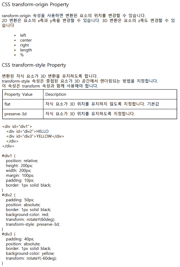
<div id="div1">
<div id="div2">HELLO
<div id="div3">YELLOW</div>
</div>
</div>
</body>
</html>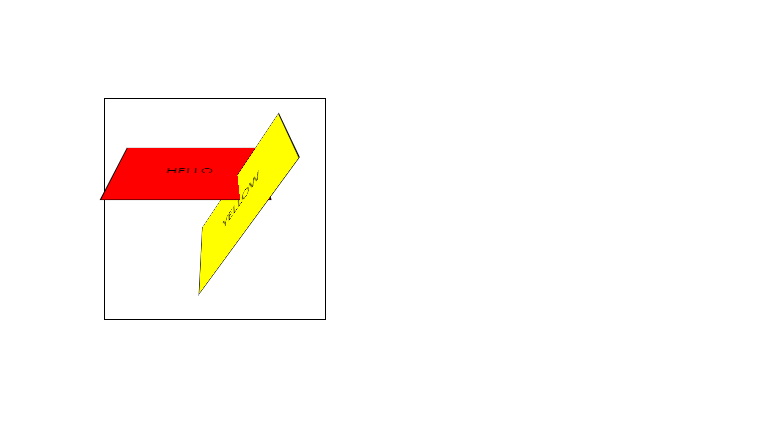
<transform, perspective 속성 예제>
<!DOCTYPE html>
<html lang="ko">
<head>
    <meta charset="UTF-8">
    <meta http-equiv="X-UA-Compatible" content="IE=edge">
    <meta name="viewport" content="width=device-width, initial-scale=1.0">
    <title>Document</title>
    <style>
        #myDIV {
            height:300px;
        }
        #div1 {

            position: relative;
            margin: auto;
            height: 150px;
            width: 250px;
            padding: 10px;
            border: 1px solid black;
            perspective: 600px;
        }
        #div2 {
            padding: 50px;
            position: absolute;
            border: 1px solid black;
            background-color: red;
            transform: rotateX(45deg);
        }

    </style>
</head>
<body>
    <div id="myDIV">
        <div id="div1">DIV1
            <div id="div2">Think that you are looking at a wall of a building. See what happens with the perspective when you gradually move
            closer to the building. </div>
       </div>
    </div>
</body>
</html>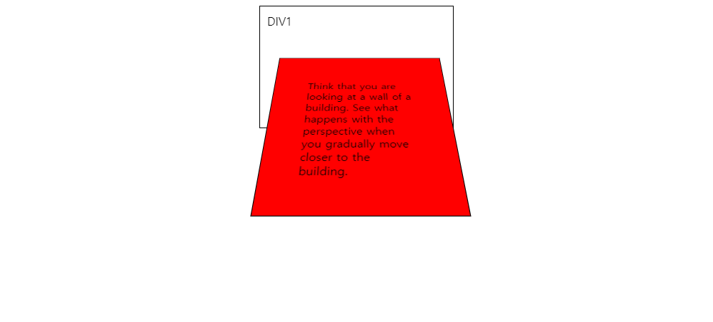
<!DOCTYPE html>
<html lang="ko">
<head>
<meta charset="UTF-8">
<meta http-equiv="X-UA-Compatible" content="IE=edge">
<meta name="viewport" content="width=device-width, initial-scale=1.0">
<title>Transition</title>
<style>
div {
width: 200px;
height: 20px;
border: 1px solid #8ac007;
margin: 10px;
padding: 10px;
cursor: pointer;
transition-property: all;
transition-duration: 1s;
transition-timing-function: cubic-bezier(0,1.36,1,-0.1);
}
.div1:hover {
background: #8ac007;
color: #fff;
}
.div2:hover {
margin-left: 50px;
}
.div3:hover {
border-width: 10px;
}
.div4:hover {
width: 400px;
height: 400px;
}
.div5:hover {
width: 400px;
}
</style>
</head>
<body>
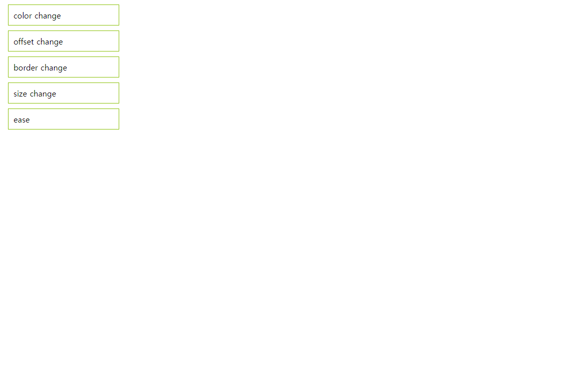
<div class="div1">color change</div>
<div class="div2">offset change</div>
<div class="div3">border change</div>
<div class="div4">size change</div>
<div class="div5">ease</div>
</body>
</html>
<!DOCTYPE html>
<html lang="ko">
<head>
    <meta charset="UTF-8">
    <meta http-equiv="X-UA-Compatible" content="IE=edge">
    <meta name="viewport" content="width=device-width, initial-scale=1.0">
    <title>Transition</title>
    <style>
        ul {
            list-style: none;
            display: flex;
            justify-content: center;
        }
        ul li {
            width: 200px;
            height: 150px;
            overflow: hidden;
        }
        ul li img {
            width: 100%;
            height: 100%;
            object-fit: cover;
            transition: transform 1s linear;
        }
        ul li:hover img {
            transform: scale(1.5);
        }
    </style>
</head>
<body>
    <ul>
        <li><img src="images/photo1.jpg" alt="photo1"></li>
        <li><img src="images/photo2.jpg" alt="photo2"></li>
        <li><img src="images/photo3.jpg" alt="photo3"></li>
        <li><img src="images/photo4.jpg" alt="photo4"></li>
    </ul>
</body>
</html>

<!DOCTYPE html>
<html lang="ko">
<head>
<meta charset="UTF-8">
<meta http-equiv="X-UA-Compatible" content="IE=edge">
<meta name="viewport" content="width=device-width, initial-scale=1.0">
<title>Transition</title>
<style>
ul {
list-style: none;
display: flex;
justify-content: center;
}
ul li {
position: relative;
width: 200px;
height: 150px;
overflow: hidden;
}
ul li img {
width: 100%;
height: 100%;
object-fit: cover;
transition: transform 1s linear;
transform-origin: right bottom;
}
.box {
position: absolute;
left: 0;
top: 0;
width: 100%;
height: 100%;
background: rgba(0,0,0,0.5);
color: #fff;
text-align: center;
display: flex;
flex-direction: column;
justify-content: center;
transition: all 1s;
}
ul li:first-child .box {
left: 100%;
}
ul li:first-child:hover .box {
left: 0;
}
ul li:nth-child(2) .box {
top: -100%;
}
ul li:nth-child(2):hover .box {
top: 0;
}
ul li:nth-child(3) .box {
transform: scale(0);
}
ul li:nth-child(3):hover .box {
transform: scale(1);
}
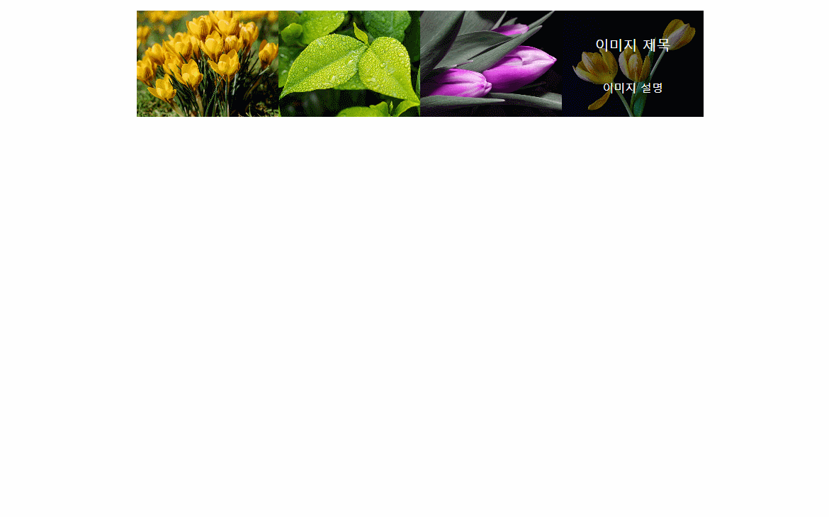
.box .title {
font-size: 20px;
}
</style>
</head>
<body>
<ul>
<li>
<img src="images/photo1.jpg" alt="photo1">
<div class="box">
<p class="title">이미지 제목</p>
<p class="content">이미지 설명</p>
</div>
</li>
<li>
<img src="images/photo2.jpg" alt="photo2">
<div class="box">
<p class="title">이미지 제목</p>
<p class="content">이미지 설명</p>
</div>
</li>
<li>
<img src="images/photo3.jpg" alt="photo3">
<div class="box">
<p class="title">이미지 제목</p>
<p class="content">이미지 설명</p>
</div>
</li>
<li>
<img src="images/photo4.jpg" alt="photo4">
<div class="box">
<p class="title">이미지 제목</p>
<p class="content">이미지 설명</p>
</div>
</li>
</ul>
</body>
</html>