HTML5 & CSS3 : svg 태그
2022.11.10.
- UI/UX 반응형 웹디자인&웹퍼블리셔 개발자 과정 - DAY 40
Review
오늘은 수학시간이었다. 하하하
오랫동안 잊고 살았던 원주율, 원의 둘레, 함수 등... 기본적인 산수는 덤으로 ^_^
polyline 예제를 실행할 때는 헤롱헤롱이었던 것 같다.
헷갈려서 다른 분들의 블로그를 찾아보니 polyline을 이용해서 도형도 그리고,
그래프도 그리시는 걸 보았다... 천재이신가용
갈길이 멀다는 것을 또 다시 깨달았다.
코딩을 배우면서 인내하는 법과 한없이 겸손해지는 법을 배우는 것 같다 ㅎㅎㅎㅎ
끊임없이 공부하고 노력해서 성장하도록 파이팅해야지-
- UI/UX 반응형 웹디자인&웹퍼블리셔 개발자 과정 - DAY 40
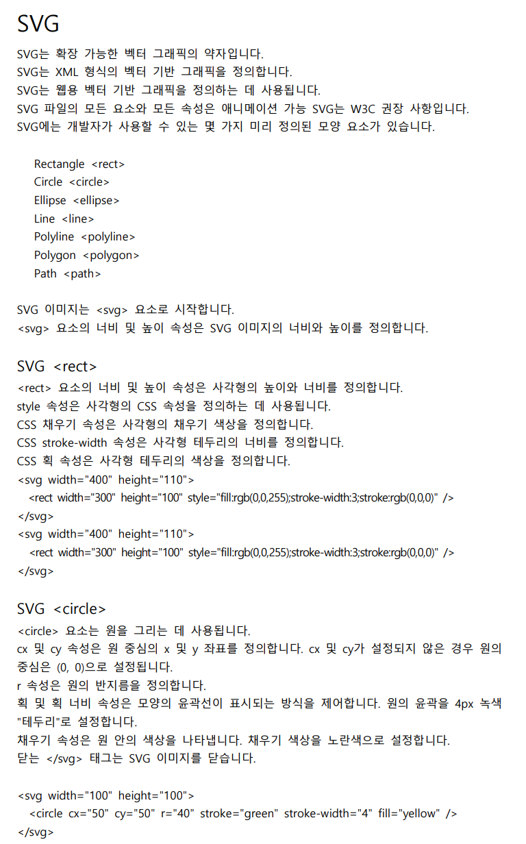
1. rectangle (사각형)
<rect x="10" y="10" width="30" height=30">
<rect x="60" y="10" rx="10" ry="10" width="30" height=30">
- x : 사각형의 좌측 상단의 x 값을 의미한다
- y : 사각형의 좌측 상단의 y 값을 의미한다.
- width : 사각형의 폭을 나타낸다
- height : 사각형의 높이를 나타낸다.
- rx : 사각형의 둥근 꼭짓점의 x 방향으로의 반지름이다
- ry : 사각형의 둥근 꼭짓점의 y 방향으로의 반지름이다.
2. circle (원형)
<circle cx=" " cy="" r=" ">
- cx : 원형의 좌측 상단의 x 값을 의미한다
- cy : 원형의 좌측 상단의 y 값을 의미한다
- r : 반지름
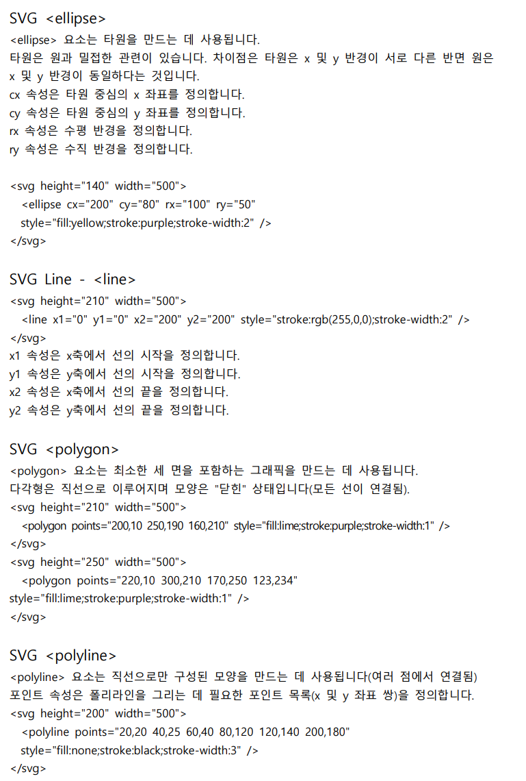
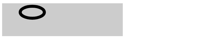
3. ellipse (타원)
<ellipse cx=" " cy=" " rx="" ry=" ">
- cx : 원형의 좌측 상단의 x 값을 의미한다
- cy : 원형의 좌측 상단의 y 값을 의미한다
- rx : 원형 가로 (x) 방향으로의 반지름이다
- ry : 원형 세로(y) 방향으로의 반지름이다
4.line (선)
: 포인트의 값을 x축, y축으로 구분하여 어느 방향으로 직선을 그을 것인지 정한다.
<line x1=" " y1=" " x2=" " y2=" ">
5. polyline (연결된 직선그룹)
: 포인트의 값을 , 로 구분하여 연결한다. 선으로줄 경우, 시작위치에서 끝나야 한다.
<polyline points="x y, x y, x y">
6. polygon (다각형)
: polygon은 점을 연결하는 직선으로 구성된다는 점에서 polyline과 매우 유사하다.
하지만 다각형의 경우, 자동으로 마지막 포인트로부터 첫 번째 포인트로 직선을
만들어서 닫힌 모양을 만든다.
<polygon points="x y, x y, x y">
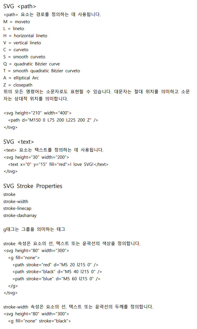
<SVG 태그 알아보기>
- HTML
<body>
    <svg width="400" height="110">
        <rect x="0" y="0" width="300" height="100" style="fill: none;stroke-width:10;stroke:rgb(0,0,0)" />
    </svg>
</body>
svg 태그는 인라인 속성을 가지고 있다.
rect 라는 태그 안에 먼저 x, y 좌표를 넣는데, 사각형을 어디서부터 시작할 건지 지정하는 것이다.
다음으로 width, height를 지정하고 fill 속성으로 어떤 색상을 넣을 것인지 정한다.
stroke-width는 stroke의 두께를 말하고, stroke의 색상을 정할 수도 있다.
- CSS
body {
    font: 1em opensans, notosansKR;
    color: #202124;
}
svg {
    background: #ccc;
}
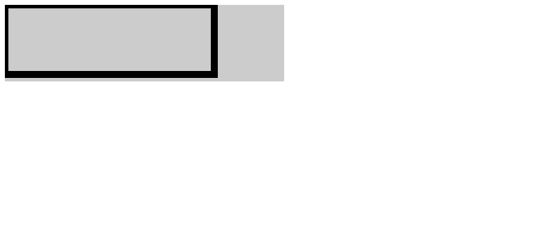
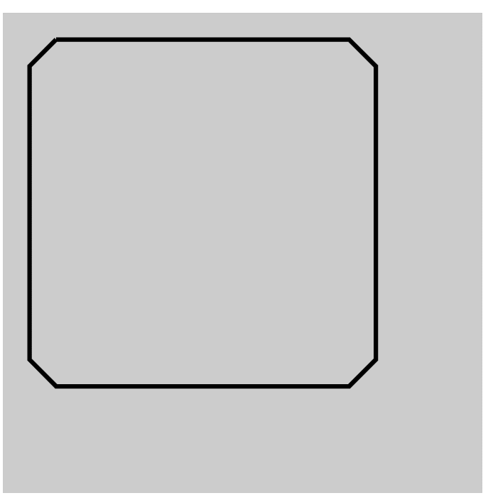
시작점을 0,0 으로 지정했기 때문에 background와 사각형의 시작점이 일치하고,
width=400, height=110로 지정한 svg 영역 안에 사각형이 그려진 것을 볼 수 있다.
<svg 태그로 사각형, 원 그려보기>
- HTML
<svg width="400" height="110">
      <rect x="5" y="5" width="300" height="100" style="fill: none;stroke-width:10;stroke:rgb(0,0,0)" />
</svg>
<br>
<svg width="400" height="110">
      <circle cx="100" cy="100" r="40" fill="none" stroke-width="10" stroke="rgb(0,0,0)" />
</svg>
svg 태그가 인라인 속성을 가지고 있어서, 보기 쉽게 하기 위해 br 태그로 줄바꿈을
시켜주었다.
circle 태그를 작성해 원을 그릴 것이고, cx, cy 좌표를 작성해 시작점을 지정할 수 있다.
r="40" 이라는 것은 반지름이 40인 원을 그린다는 말이다.
- CSS
body {
    font: 1em opensans, notosansKR;
    color: #202124;
}
svg {
    background: #ccc;
}
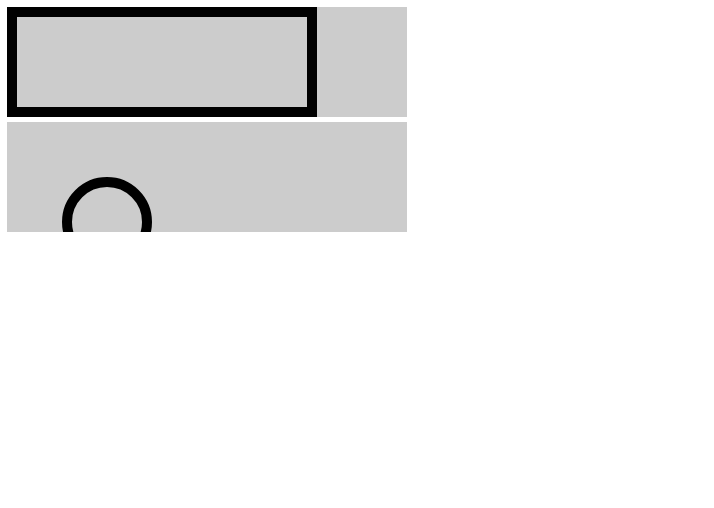
결과는 svg 태그의 영역을 초과했기 때문에 원이 잘린 것처럼 보인다.
<svg width="400" height="110">
        <circle cx="50" cy="50" r="40" fill="none" stroke-width="10" stroke="rgb(0,0,0)" />
    </svg>
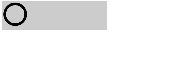
cx, cy 좌표를 50, 50으로 설정하면 원이 완전히 보이게 된다.
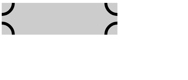
<svg width="400" height="110">
        <circle cx="0" cy="0" r="40" fill="none" stroke-width="10" stroke="rgb(0,0,0)" />
        <circle cx="0" cy="110" r="40" fill="none" stroke-width="10" stroke="rgb(0,0,0)" />
        <circle cx="400" cy="110" r="40" fill="none" stroke-width="10" stroke="rgb(0,0,0)" />
        <circle cx="400" cy="0" r="40" fill="none" stroke-width="10" stroke="rgb(0,0,0)" />
</svg>
<ellipse 알아보기>
<svg width="400" height="110">
        <ellipse cx="100" cy="30" rx="40" ry="20" fill="none" stroke-width="10" stroke="rgb(0,0,0)" />
</svg>
ellipse는 타원형을 말하기 때문에, rx, ry 반지름의 가로 세로를 각각 지정하여 디테일하게
설정할 수 있다.
<line / stroke-linecap 알아보기>
<svg width="500" height="500">
     <line x1="10" y1="10" x2="100" y2="100" stroke-width="10" stroke="rgb(255,0,0,0.5)" stroke-linecap="butt" />
</svg>
<svg width="500" height="500">
     <line x1="10" y1="10" x2="100" y2="100" stroke-width="10" stroke="rgb(0,255,0,0.5)" stroke-linecap="round" />
</svg>
<svg width="500" height="500">
     <line x1="10" y1="10" x2="100" y2="100" stroke-width="10" stroke="rgb(0,0,255,0.5)" stroke-linecap="square" />
</svg>
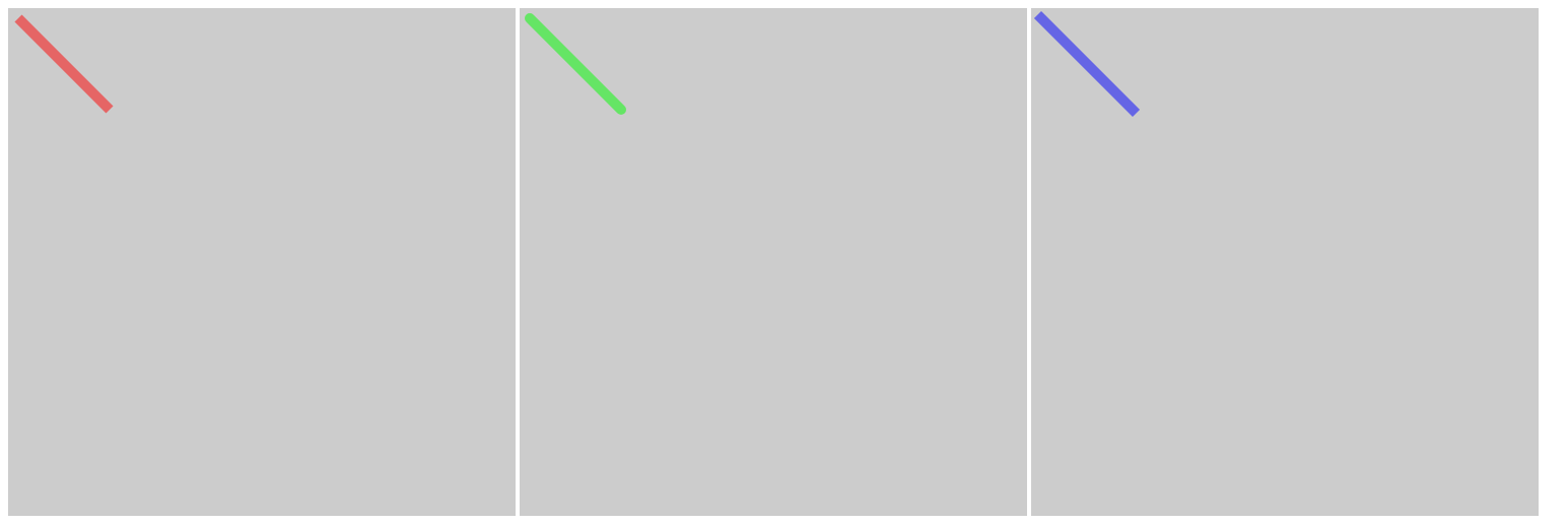
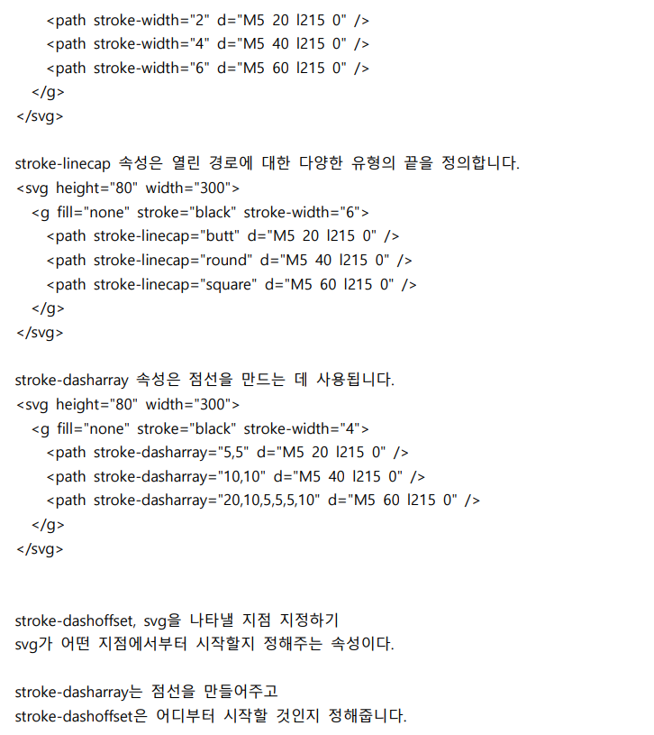
stroke-linecap 속성은 line의 끝이나 꺾어지는 부분을 딱딱하게 표현할 것인지,
둥글게 표현할 것인지 설정할 때 이용한다.
속성값으로는 butt, round, square 3가지가 있는데,
자세히 보면 butt는 기본값으로, line 끝이 날카로운 90도 각도로 획을 끝낸다.
square는 line 끝이 butt와 유사하지만 path의 길이를 넘어 획을 확장한다는 점에서 조금 다르다.
round는 시작점과 끝점을 매끄럽게 하는 반경을 추가한다.
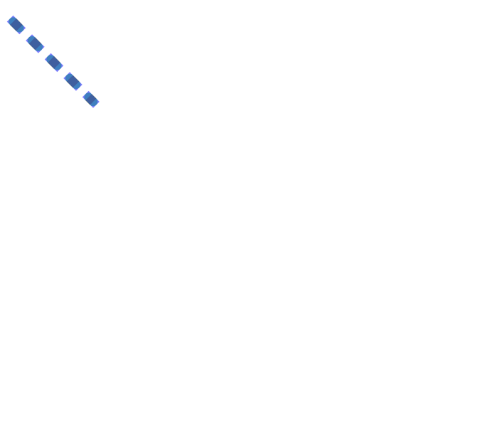
<line / stroke-dasharray 알아보기>
- HTML
    <svg width="500" height="500" id="svg1">
        <line x1="10" y1="10" x2="100" y2="100" stroke-width="10" stroke="rgba(255,0,0,0.5)" stroke-linecap="butt"/>
     </svg>
     <svg width="500" height="500" id="svg2">
        <line x1="10" y1="10" x2="100" y2="100" stroke-width="10" stroke="rgba(0,255,0,0.5)" stroke-linecap="round"/>
    </svg>
     <svg width="500" height="500" id="svg3">
        <line x1="10" y1="10" x2="100" y2="100" stroke-width="10" stroke="rgba(0,0,255,0.5)" stroke-linecap="square"/>
    </svg>
- CSS
#svg1, #svg2, #svg3 {
    position: absolute;
    background: none;
}
#svg1 {
    stroke-dasharray: 10px 20px;
}
#svg2 {
    stroke-dasharray: 10px 20px;
}
#svg3 {
    stroke-dasharray: 10px 20px;
}
<polyline 알아보기>
<svg width="500" height="500">
    <polyline points="10,10 400,10 400,400 10,400 10,10" stroke-width="1" stroke="rgba(0,0,0)" fill="none" />
</svg>
- HTML
<svg width="500" height="500" id="svg4">
     <polyline points="40,10 370,10 400,40 400,370 370,400 40,400 10,370 10,40 40,10" fill="none" stroke-width="5" stroke="rgb(0,0,0)" stroke-dasharray="1600" />
</svg>
- CSS
#svg4 {
    padding: 20px;
    animation: ani 5s infinite;
}
@keyframes ani {
    0% {stroke-dashoffset: 1600;}
    100% {stroke-dashoffset: 0;}
}
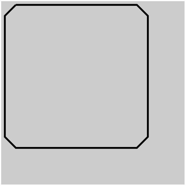
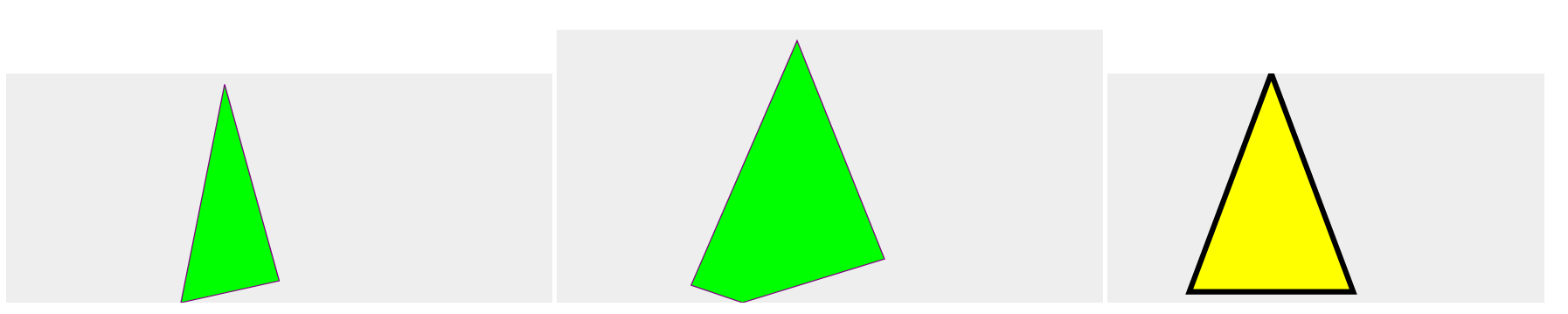
<polygon 태그로 다각형 그려보기>
    <svg height="210" width="500">
        <polygon points="200,10 250,190 160,210" style="fill:lime;stroke:purple;stroke-width:1" />
    </svg>
    <svg height="250" width="500">
        <polygon points="220,10 300,210 170,250 123,234"
       style="fill:lime;stroke:purple;stroke-width:1" />
    </svg>
    <svg height="210" width="400">
        <path d="M150 0 L75 200 L225 200 Z" fill="yellow" stroke="black" stroke-width="5" />
   </svg>
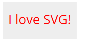
<svg 태그 안에 text 태그를 이용해 문구 넣어보기>
   <svg width="200" height="100">
    <text x="15" y="60" fill="red" font-size="35">I love SVG!</text>
   </svg>
<svg 태그에 animation 적용하기>
"원의 둘레 (l) = 2πr"
수학을 다시 하게 될 줄이야...
기초 수학이라 다행이지만 더 어려운 거 나오면 ebs라도 들어야 하나 흐엉
반지름이 100인 원을 만들어 볼 것이다. 그러면 원의 둘레는 628이 된다.
- HTML
    <svg width="500" height="500" id="svg1">
        <circle cx="230" cy="240" r="100" fill="none" stroke-width="5" stroke="rgb(0,0,0)" stroke-dasharray="628"/>
    </svg>
- CSS
#svg1 {
    background: #eee;
    animation: ani 1s infinite;
}
@keyframes ani {
    0% {stroke-dashoffset: 628;}
    100% {stroke-dashoffset: 0;}
}
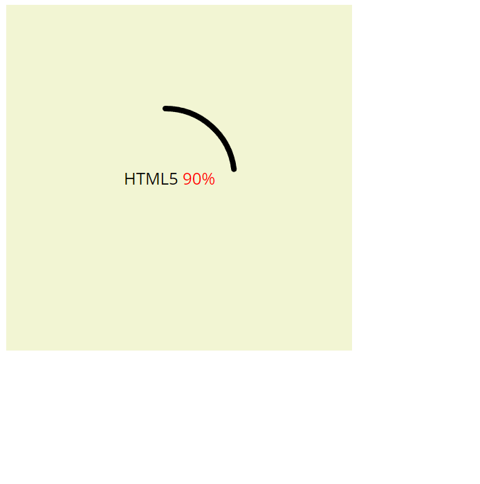
3시 방향에서 시작하는 원 애니메이션을 만들어주었다.
<svg 태그에 animation 적용하기 2>
- HTML
    <svg width="500" height="500">
        <circle cx="250" cy="230" r="100" fill="none" stroke-width="8" stroke="rgb(0,0,0)" stroke-linecap="round" stroke-dasharray="628"/>
        <text x="170" y="-240" fill="#000">HTML5 <tspan fill="#f00">90%</tspan></text>
    </svg>
- CSS
body {
    font: 1em opensans, notosansKR;
    color: #202124;
}
svg {
    font: opensans;
    font-size: 24px;
    background: rgb(242, 245, 211);
    animation: ani 1s infinite;
    transform: rotate(-90deg);
}
svg text {
    transform: rotate(90deg);
}
@keyframes ani {
    0% {stroke-dashoffset: 628;}
    100% {stroke-dashoffset: 100;}
}
svg에 transform: rotate(-90deg);를 적용한 이유는, 원 애니메이션이 기본적으로 3시 방향
에서부터 시작되는데, 왼쪽으로 90도 회전시키면 12시 방향에서부터 시작하게 된다.
그런데 문구는 똑바로 보이도록 해야하니 svg text에다가 반대로
transform: rotate(90deg); 를 적용해주었다.
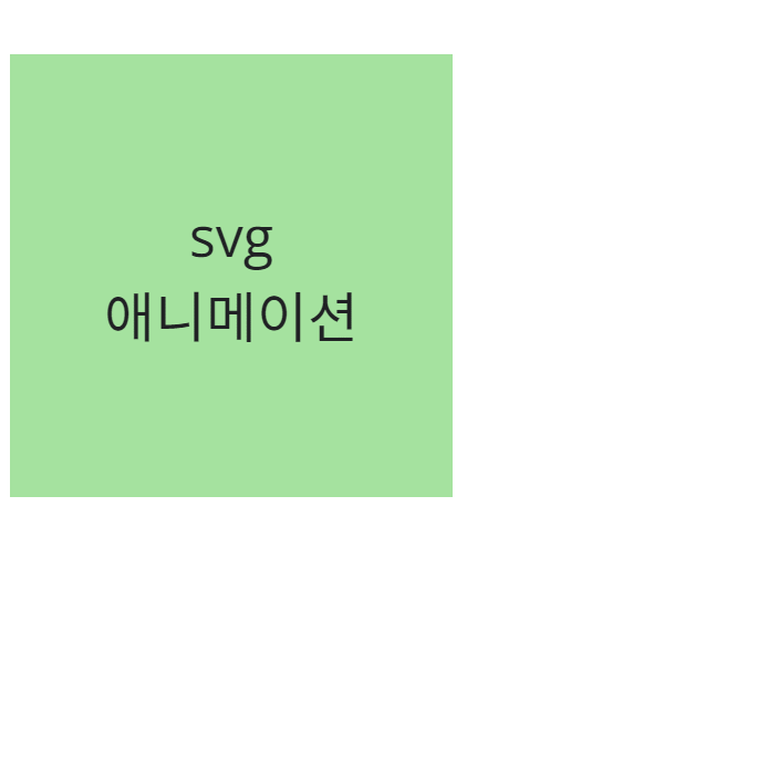
<:hover 상태에서 svg animation 적용해보기>
: 그냥 svg 태그에 text 태그를 넣어 문구를 넣어도 되지만, 선생님께서 그렇게 하지 말고 다른
방식으로 자유롭게 만들어보라고 하셔서 머리를 굴려보았다.
- HTML
    <div class="text">
        <p>
            <span>svg</span>
            <span>애니메이션</span>
        </p>
        <svg>
            <rect width="400" height="400" fill="none" stroke-width="10" stroke="#000"/>
        </svg>
    </div>
text 라는 div를 하나 만들고, p 태그를 넣은 다음 display: flex;로 줄바꿈을 시켜볼 생각
으로 span 태그를 각각 작성했다.
width, height를 각각 400씩 주고, 눈에 보이는 stroke 두께는 5 정도 되도록 넉넉잡아
stroke-width는 10으로 설정했다.
- CSS
.text {
    position: relative;
    width: 400px;
    height: 400px;
    background: rgb(165, 226, 159);
}
.text p {
    display: flex;
    width: 400px;
    height: 400px;
    flex-direction: column;
    justify-content: center;
    font-size: 50px;
    text-align: center;
}
svg {
    position: absolute;
    left: 0;
    top: 0;
    width: 400px;
    height: 400px;
    stroke-dasharray: 1600;
    stroke-dashoffset: 1600;
}
.text svg:hover {
    animation: ani 1s forwards;
}
@keyframes ani {
    0% {stroke-dashoffset: 1600;}
    100% {stroke-dashoffset: 0;}
}
CSS가 조금 골치 아프다.
우선 .text에서 width, height를 svg 크기와 같게 설정하고 background를 넣는다.
.text p에서는 display: flex;를 주고, flex-direction: column;으로 두어 문구가 세로로 정렬되게
만든다. justify-content는 center로 설정해 가운데 정렬시킨다.
svg가 p 태그 때문에 밑으로 떨어지는데,
이때 svg 태그의 부모인 .text에다가 position: relative;를 주고,
svg에다가 position: absolute;를 주어 left: 0;, top:0;으로 설정하면 문제가 없다.
나머지는 위와 같이 작성하면 원하던 결과가 나오게 된다.
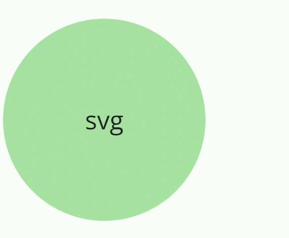
<:hover 상태에서 svg animation 적용해보기 2>
- HTML
    <div class="svg2">
        <p>svg</p>
        <svg>
        <circle cx="200" cy="200" r="197.5" fill="none" stroke-width="5" stroke="rgb(0,0,0)" stroke-linecap="round" />
        </svg>
    </div>
반지름 값을 197.5로 준 이유는 stroke 값까지 감안해서 2.5 정도 빼준 것이다.
svg의 width와 height 값에 딱 떨어지게 반지름 값을 200으로 주면 stroke이 잘려진 채로
보이기 때문이다.
2.5 정도 빼고 주면 stroke이 정상적으로 보인다.
- CSS
.svg2 {
    position: relative;
    width: 400px;
    height: 400px;
    background: rgb(165, 226, 159);
    border-radius: 50%;
}
.svg2 p {
    width: 400px;
    height: 400px;
    line-height: 400px;
    font-size: 50px;
    text-align: center;
}
.svg2 svg {
    position: absolute;
    left: 0;
    top: 0;
    width: 400px;
    height: 400px;
    stroke-dasharray: 1256;
    stroke-dashoffset: 1256;
}
.svg2 svg:hover {
    animation: ani2 1s forwards;
    transform: rotate(-90deg);
}
@keyframes ani2 {
    0% {stroke-dashoffset: 1256;}
    100% {stroke-dashoffset: 0;}
}
.svg2 svg:hover에서 transform: rotate(-90deg);를 둔 이유는 animation의 시작점을
3시 방향에서 12시 방향으로 변경하기 위함이다.
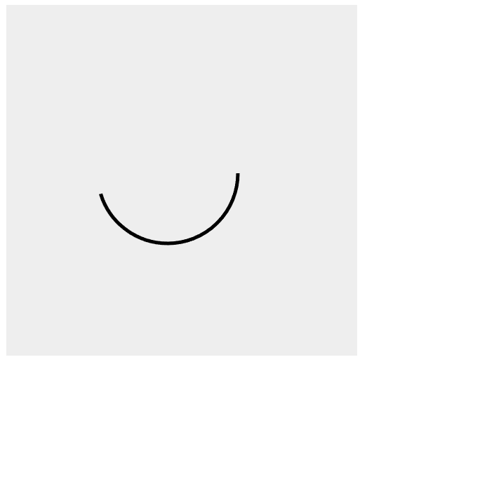
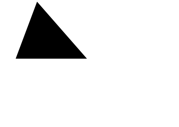
    <svg height="210" width="400">
        <path d="M150 0 L75 200 L225 200 l100 0" />
        <!-- 대문자 L은 절대좌표, 소문자 l은 상대좌표 (바로 직전 좌표가 원점으로 생각) -->
    </svg>
Material Symbols and Icons - Google Fonts
Material Symbols and Icons - Google Fonts
Material Symbols are our newest icons consolidating over 2,500 glyphs in a single font file with a wide range of design variants.
fonts.google.com
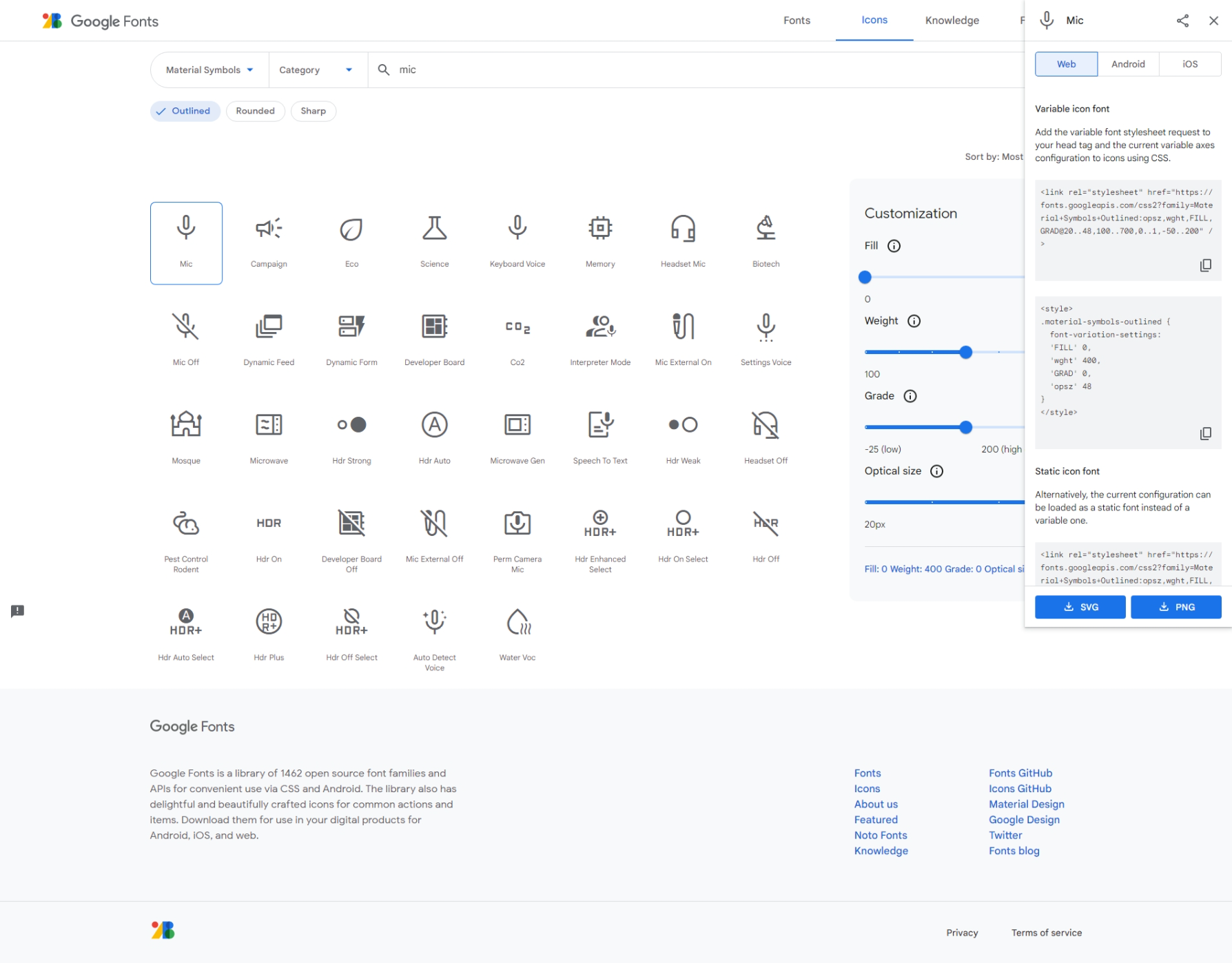
Google Font 사이트로 들어가 icons에서 'mic' 라고 검색하면 맨 처음에 마이크 아이콘이 나온다.
그러면 오른쪽에 SVG 파일을 다운 받을 수 있는 옵션 바가 나타난다.
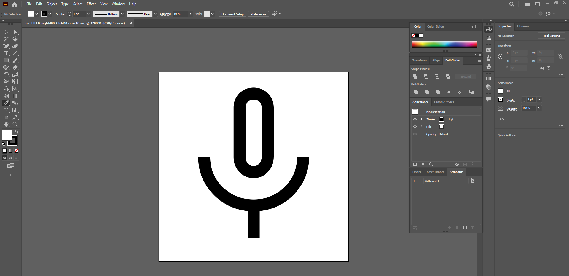
다운로드 받고 나서 일러스트를 켜고 다운 받은 파일을 불러온다.
먼저 아이콘을 선택하고 나서 오른쪽 마우스를 클릭해 'Release Compound Path'를 선택한다.
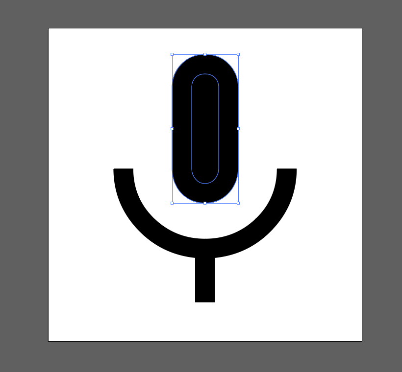
그러면 위와 같이 나타나는데, 두 타원을 함께 선택해 색을 변경한다.
색을 변경하고 나서, path를 잘라줄텐데 line tool을 들고 자를 부분에 선을 그어준다.
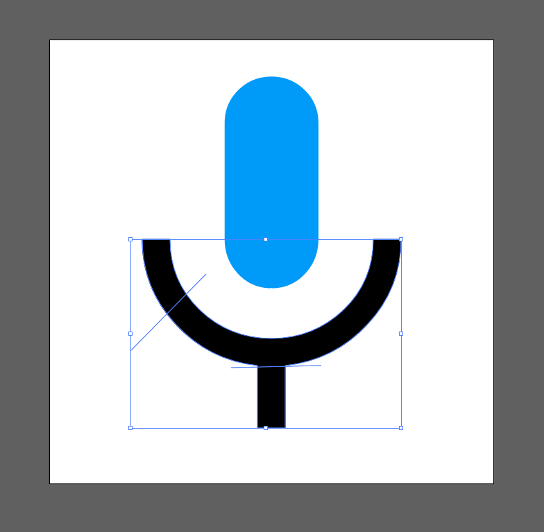
밑 부분을 모두 선택해서 오른쪽 마우스를 클릭하고 Group을 눌러 묶어준다.
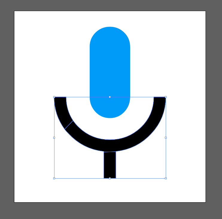
Pathfinder에서 Divide를 눌러주면 위와 같이 나타난다.
오른쪽 마우스를 눌러 Ungroup을 클릭해주면 Path가 각각 분리된다.
그러고 나서 각각 선택해 색상을 변경해주면 된다.
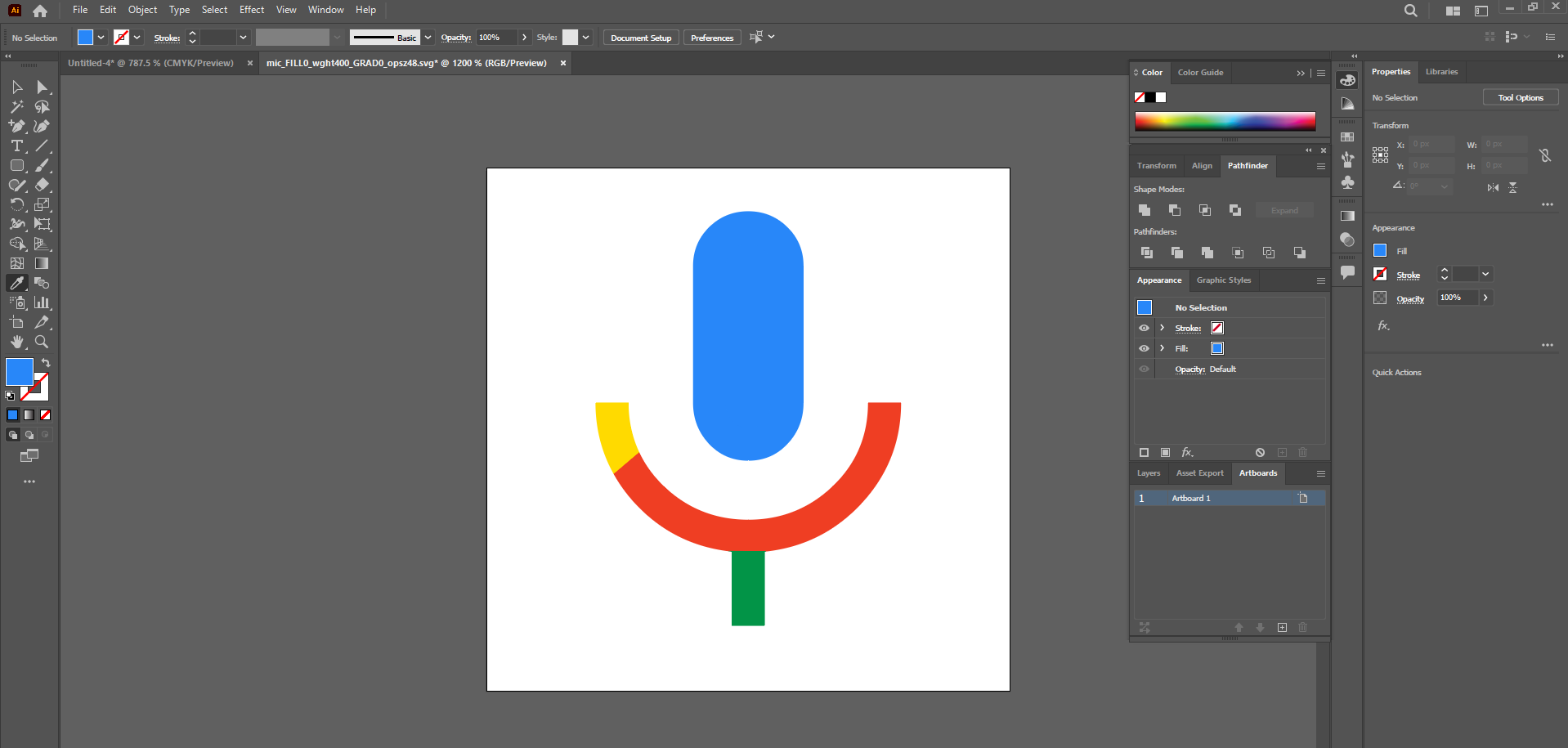
완성 - !
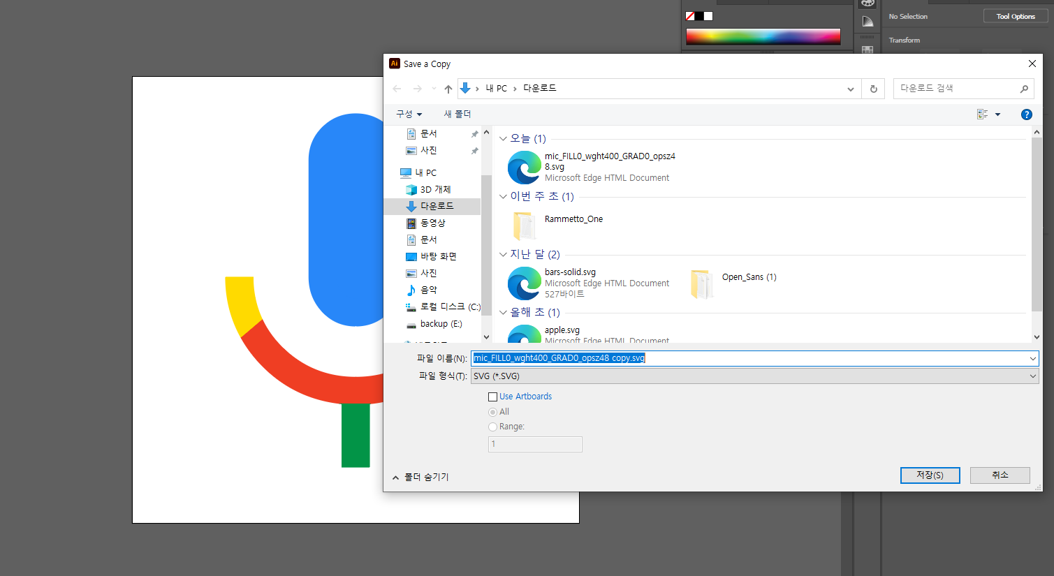
File - Save a Copy 로 들어가 파일 형식을 SVG 파일로 바꿔주고 저장 버튼을 누른다.
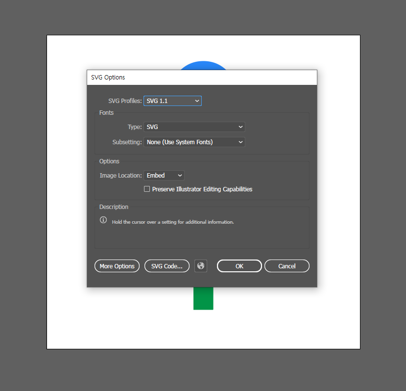
여기서 SVG Code 버튼을 누르면,
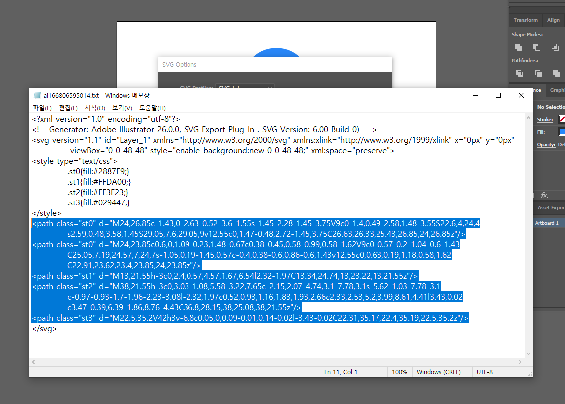
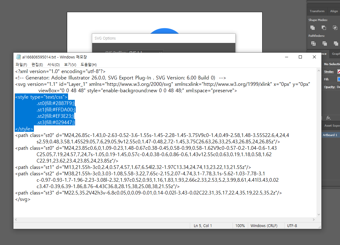
메모장에 이런 코드가 나타나는데, 위의 이미지에서 긁은 코드는 복사해서
HTML에 넣어주고, 밑의 이미지에서 긁은 코드는 복사해서 CSS에서 붙여넣기 하면 된다.
<!DOCTYPE html>
<html lang="ko">
<head>
    <meta charset="UTF-8">
    <meta http-equiv="X-UA-Compatible" content="IE=edge">
    <meta name="viewport" content="width=device-width, initial-scale=1.0">
    <title>SVG</title>
    <style type="text/css">
        .st0{fill:#2887F9;}
        .st1{fill:#FFDA00;}
        .st2{fill:#EF3E23;}
        .st3{fill:#029447;}
    </style>
</head>
<body>
    <svg>
        <path class="st0" d="M24,26.85c-1.43,0-2.63-0.52-3.6-1.55s-1.45-2.28-1.45-3.75V9c0-1.4,0.49-2.58,1.48-3.55S22.6,4,24,4
        s2.59,0.48,3.58,1.45S29.05,7.6,29.05,9v12.55c0,1.47-0.48,2.72-1.45,3.75C26.63,26.33,25.43,26.85,24,26.85z"/>
    <path class="st0" d="M24,23.85c0.6,0,1.09-0.23,1.48-0.67c0.38-0.45,0.58-0.99,0.58-1.62V9c0-0.57-0.2-1.04-0.6-1.43
        C25.05,7.19,24.57,7,24,7s-1.05,0.19-1.45,0.57c-0.4,0.38-0.6,0.86-0.6,1.43v12.55c0,0.63,0.19,1.18,0.58,1.62
        C22.91,23.62,23.4,23.85,24,23.85z"/>
    <path class="st1" d="M13,21.55h-3c0,2.4,0.57,4.57,1.67,6.54l2.32-1.97C13.34,24.74,13,23.22,13,21.55z"/>
    <path class="st2" d="M38,21.55h-3c0,3.03-1.08,5.58-3.22,7.65c-2.15,2.07-4.74,3.1-7.78,3.1s-5.62-1.03-7.78-3.1
        c-0.97-0.93-1.7-1.96-2.23-3.08l-2.32,1.97c0.52,0.93,1.16,1.83,1.93,2.66c2.33,2.53,5.2,3.99,8.61,4.41l3.43,0.02
        c3.47-0.39,6.39-1.86,8.76-4.43C36.8,28.15,38,25.08,38,21.55z"/>
    <path class="st3" d="M22.5,35.2V42h3v-6.8c0.05,0,0.09-0.01,0.14-0.02l-3.43-0.02C22.31,35.17,22.4,35.19,22.5,35.2z"/>
    </svg>
</body>
</html>
결과는 이러하다.
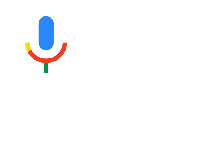
웹 페이지에서 확인해보면 위와 같이 나타난다.